Widget - Mnemonic scheme (Diagram, Plan, Process)
There are two ways to create your own mnemonic diagram of any technological process, simple and advanced.
But the first and most difficult, regardless of the method of creating a mnemonic diagram, is to draw a picture of your technological process or floor plan.
Hire a designer, draw yourself in a graphics editor, download it on the Internet, the main thing is to get a beautiful image in PNG or JPEG format. The image resolution must match the resolution of your monitor.
The background image must be placed on an external resource that provides a direct Internet link to the image, for example, imgBB / Radikal, Uploads, Vfl, Netpics, Hostingkartinok, Picshare, Yapx or other services.
By the way, the background image is also available for simple indicator widgets, with its help you can, for example, add your logo or an image to decorate the widget.
When working on a tablet or smartphone, you must turn on the "Edit" mode, in the "Tools" menu, to be able to change the size and location of widgets, as well as to further edit the location of labels and data on the diagram.
Method 1 - Simple.
In the Chart Widgets menu, click on the first mnemonic widget and create a widget on the board.
In the settings menu that opens, click "Cancel".
Or choose any of your devices and any data. But in this case, unnecessary data from the device may be displayed on the widget, to hide it, in the "Arithmetic operation" menu select f (x) and enter:
'<div></div>'
This will hide unwanted data in the picture.
Scale the widget to the needed size.
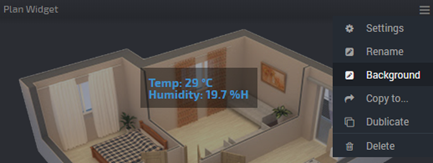
In the menu of the newly created widget, select "Background" and enter the address to your picture.
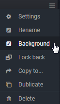
| In the widget menu, select "Lock back", this will move the widget to the back layer.
|
Then everything is simple, create any other widgets (indicators, tables or charts) with the necessary data and simply place them in the right places of your diagram.
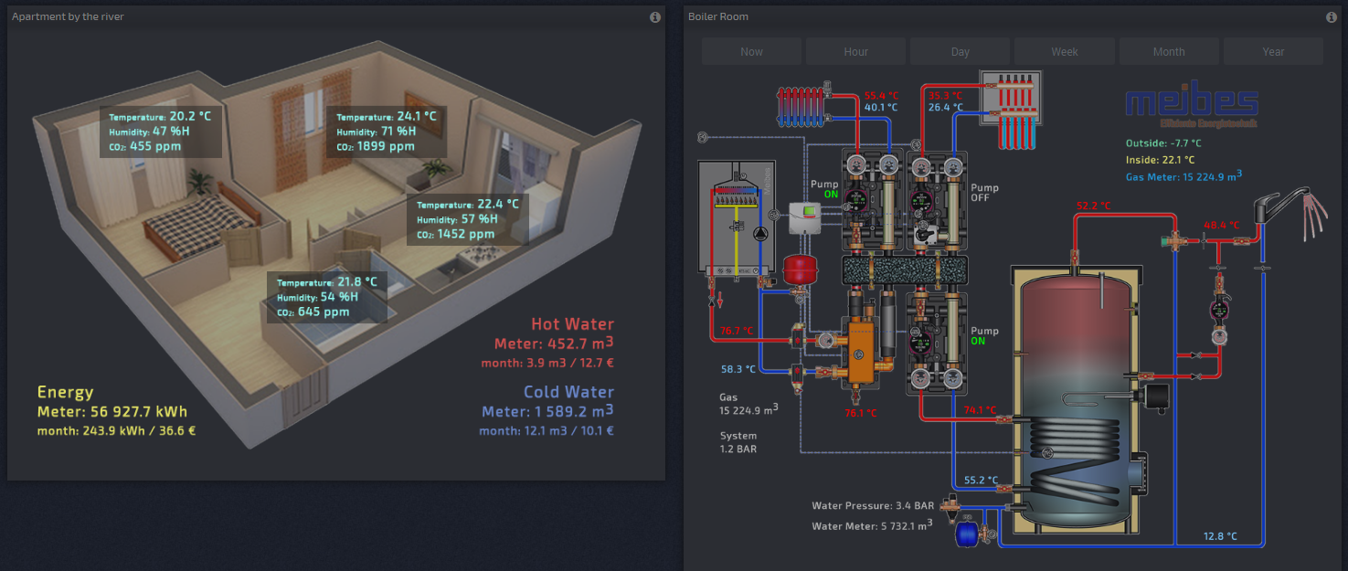
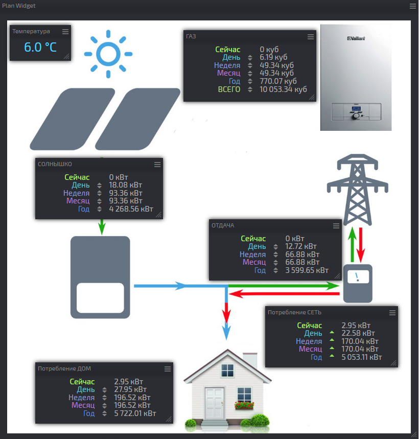
Here is a good example of a client with monitoring a household with a solar power plant:
https://dash.smart-maic.com/sharedash259430620
Method 2 - Advanced.
To take full advantage of the tool for creating your own plans and schemes, it is advisable to know HTML and JavaScript at the elementary level. But even if there is no such knowledge, do everything carefully according to the instructions, and everything will work.
Add a Widget with a plan to the active dashboard.
When creating a widget, the settings window opens. Some options for the plan widget are not available, such as "Info-text", "Data symbol" and the "Display changes" switch.
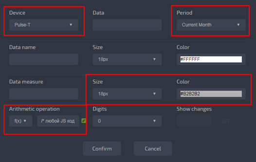
It is enough to define “Device” and “Period”, all other changes, including “Color” and “Font Size”, can be edited as JS + HTML code in the section “Arithmetic Operation” with the selected function f (x). If the code does not define the color and size, then the values from the widget settings will be used.
Open the "Background" menu to define the background image in JPEG or PNG format.
Set the widget size and return to the widget settings menu.
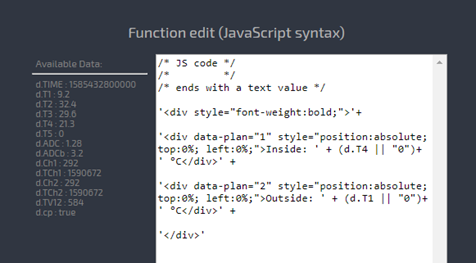
Open the function editing window, the “Change” icon in the “Arithmetic Operation” section, for editing JavaScript code:
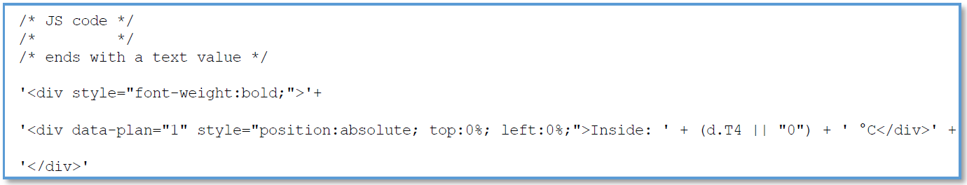
In this case, the JS code ends with a simple text value, it is text surrounded by single quotes on both sides. Using the “+”, you can combine several text values and add a JS code between text values. As a result of execution, everything will be combined into one line of ready HTML code, something like this:
'<div style="font-weight:bold;"><div data-plan="1" style="position:absolute; top:0%; left:0%;">Inside: 22.5 °С</div></div>'
Between / * - * / are comments that do not affect code execution.
Let's analyze HTML tags.
The first parent DIV is optional
<div style="font-weight:bold;">...</div>
but convenient if you need to declare styles for all internal data tags, background, font size and color, frame, etc.
The second DIV inside and this is the tag with our data, which will
be displayed on the scheme and which can be moved with the mouse, as
“drag and drop”.
It has two required attributes:
data-plan="1" – the number in quotation marks can be any, but it must be unique.
style="position:absolute; top:0%; left:0%;" – you can add your own extra styles: color, font ...
Let's analyze the data Tag:
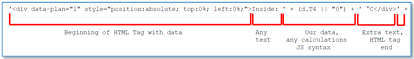
The first DIV tag ends with a ">" immediately after which there
can be any text up to a single quote, it will be displayed on the
widget. Between "+" signs you can place any calculations in JS format.
At the end of calculations, after single quotes, you can add a data
symbol, in the example "° C", and end the HTML tag.
When adding your own data lines, before the last DIV, do not forget to change the number in the attribute data-plan=, it should not be repeated in different lines of data.
You can add up to ten devices to one widget and use all their data in the calculations.
After completing the editing of the JS + HTML code, click OK and Apply.
The next step is placing our data in the right places over the scheme.
You can change the location of the data in the scheme using the
mouse. Hold the Ctrl key and grab the data text with the mouse, and they
will be with a gray border, and drag it to the desired location in the
diagram. If you are working on a tablet, make sure that the editing mode
is active in the "Edit Dashboard" menu in Tools.
Drop the data text and it is done, do not forget to save settings.
You can edit any JavaScript and HTML code in the function editing window.
A little bit more information see in the Knowledge Base »
For
the example below, we calculate the pressure value in a variable “pr”,
which can be used in the HTML code. And also combine the two values in
one block with a translucent background, as in the example widget.
/* any JS code */
/* for example, calculate the pressure */
var pr = (d.ADC>0.5 ? (d.ADC-0.5)*3 : 0).toFixed(1);

/* JS code ends with text value - this is HTML code */
'<div style="font-weight:bold;">'+

/* first row of data */
'<div data-plan="1" style="position:absolute; color:green; top:74.5%; left:1.5%; font-size:75%;">Value T1: '+(d.T1 || "0")+' °С</div>'+

/* second row of data */
'<div data-plan="2" style="position:absolute; color:cyan; top:82.0%; left:1.3%;">Value T2: '+(d.T2 || "--")+' °С</div>'+

/* third row of data, use the calculated pressure */
'<div data-plan="3" style="position:absolute; top:81.6%; left:57.4%;">Pressure: '+ pr +' BAR</div>'+

/* fourth row of data, two values in one block on a translucent background */
'<div data-plan="4" style="position:absolute; top:19.5%; left:38.2%; background-color:rgba(0,0,0,0.4); padding: 10px;"><div style="color:#3c92ca; font-size:80%;"> Value T3: '+(d.T3 || "--")+' °С</div><div style="color:#3c92ca; font-size:80%;"> Value T4: '+(d.T4 || "--")+' °С</div></div>'+

'</div>'
See an example on the Demo Dashboard: "Gas & Temperature"
https://dash.smart-maic.com/demo
Done!
Customer support service by UserEcho
