0
Answered
Time based Graph
Hello.
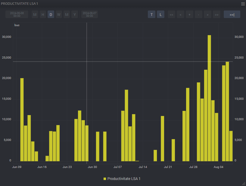
I am using a D105 G4 in pulse counting mode for tracking the output productivity of a stamping machine. The machine is working in 2 schifts daily. Everything is working well, I am getting the total value daily for both shifts that are working on that machine.
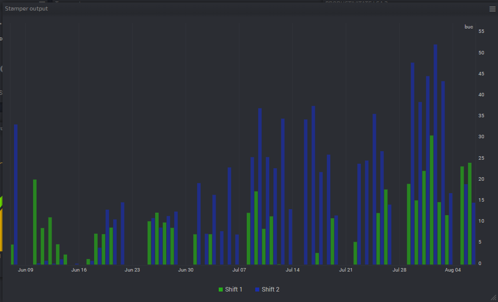
but i want to be able to split the graph into 2 working schedules : 07:00-15:00 and 15:00-23:00, so i can find out wich shift is more productive .
I need some output conditioning by time , or something similar. Can this be done ?
Now I have this :

And would like something like this :

Customer support service by UserEcho


Create two virtual values "Tariff (ratio) by Time".
7-15: Set 1 for the 7-15 interval; and 0 for the rest of the hours.
15-23: Set 1 for the 15-23 interval; and 0 for the rest of the hours.
Add both virtual values to the chart and select the chart type "Bars together"
It works !
You guys are amazing ! Thank you !
Also, regarding this topic, There are two teams, A and B. They work alternatively, Team A Shift1, Team B Shift 2, next week they switch : Team B Shift 1, Team A Shift 2 and so on. Is there any way i can track what Each TEAM is producing given the fact that they work alternatively shift 1 and shift 2 ?
It would be great to be able to sum what every Team is making.
Thank you !
It is not possible to do such a complex operation on the Dashboard.
You can only summarize data in one time.
But you can export data to EXCEL and try to make a calculation in it.
Make a widget table and add your virtual values.
Then select "Export CSV" in the menu.